Date: 2026-04-22 Page is: DBtxt003.php txt00021220
INTERNATIONAL COMPARISON
UNITED STATES -V- CHINA
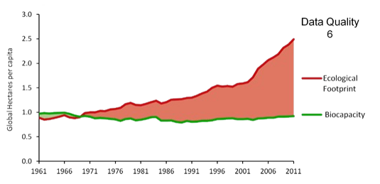
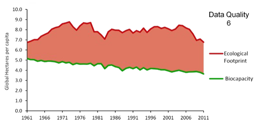
China is becoming more and the USA less unsustainable ...
but the USA is far worse than China and has been for decades
UNITED STATES -V- CHINA
China is becoming more and the USA less unsustainable ...
but the USA is far worse than China and has been for decades
| Ecological Footprint per Capita -v- Bio-Capacity | |
| China | USA |

|

|
|
Peter Burgess COMMENTARY
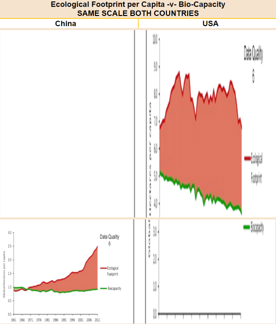
I first saw these graphics around 2013, almost 10 years ago. I was immediately bothered by the distortion caused by the different scales. The comparison changes when the same scale is used for both countries. This is typical of presentations that circulate in the USA and generally outside China. It many be factually correct, but the manner in which the data are presented makes it appear that China is rapidly overtaking or has overtaken the USA with respect to environmental damage. Puting the two graphics on the same scale gives a very different impression, but it still misrepresents the relative position of each country in two ways:
| |
| . |

| |
|
Nevertheless, the immediately above graphic is a better representation than the initial graphics presented.
This is a more realistic representation. The people of the USA have been exceeding their fair share of global biocapacity for a long time, and the Chinese population is a long way from catching up. The USA has a lot of land and relatively few people. They they are contributing to global climate dysfunction more than any other nation, and have been doing so for many decades. Also, these graphics only reflect the production dimension, not consumption! |