The Conversation ... Seven charts that show the world is actually becoming a better place
January 4, 2019 8.06am EST
Swedish academic Hans Rosling has identified a worrying trend: not only do many people across advanced economies have no idea that the world is becoming a much better place, but they actually even think the opposite. This is no wonder, when the news focuses on reporting catastrophes, terrorist attacks, wars and famines.
Who wants to hear about the fact that every day some 200,000 people around the world are lifted above the US$2-a-day poverty line? Or that more than 300,000 people a day get access to electricity and clean water for the first time every day? These stories of people in low-income countries simply doesn’t make for exciting news coverage. But, as Rosling pointed out in his book Factfulness, it’s important to put all the bad news in perspective.
While it is true that globalisation has put some downward pressure on middle-class wages in advanced economies in recent decades, it has also helped lift hundreds of millions of people above the global poverty line – a development that has mostly occurred in South-East Asia.
The recent rise of populism that has swept across Western countries, with Trump, Brexit, and the election of populists in Hungary and Italy, among various other factors, is thus of great concern if we care about global welfare. Globalisation is the only way forward to ensure that economic prosperity is shared among all countries and not only a select few advanced economies.
While some people glorify the past, one of the big facts of economic history is that until quite recently a significant part of the world population has lived under quite miserable conditions – and this has been true throughout most of human history. The following seven charts show how the world has become a much better place compared to just a few decades ago.
Even during the Industrial Revolution, average life expectancy across European countries did not exceed around 35 years. This does not imply that most people died in their late 30s or even 40s, since it was mostly very high levels of child mortality rates that pulled down the average. Women dying in childbirth was obviously a big problem too. So were some common diseases such as smallpox and the plague, for example, which now have been completely eradicated in high-income countries.
More than a century ago, child mortality rates were still exceeding 10% – even in high-income countries such as the US and the UK. But thanks to modern medicine, and better public safety in general, this number has been reduced to almost zero in rich countries.
Plus, developing economies like India and Brazil now have much lower child mortality rates today than advanced economies had at similar income levels about one century ago.
Even though many are concerned about the global population explosion, the fact is that fertility rates have fallen significantly across the globe. UN population estimates largely expect the global population to stabilise at about 11 billion by the end of this century.
Moreover, as can be seen from the chart, many developing countries such as Brazil, China and a number of African nations have already switched to a low-fertility regime. While this transition took many advanced economies almost 100 years, starting with the Industrial Revolution, many others have since achieved this over just two to three decades.
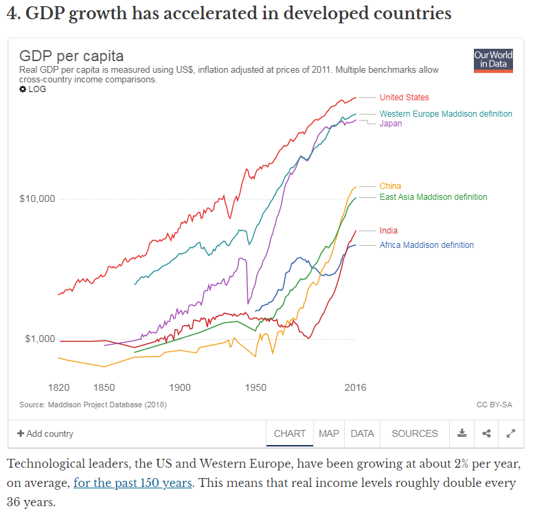
Technological leaders, the US and Western Europe, have been growing at about 2% per year, on average, for the past 150 years. This means that real income levels roughly double every 36 years.
While there were many long-lasting ups and downs, like the Great Depression or the recent Great Recession, the constancy of the long-run growth rate is actually quite miraculous. Low-income countries, including China and India, have been growing at a significantly faster pace in recent decades and are quickly catching up to the West. A 10% growth rate over a prolonged period means that income levels double roughly every seven years. It is obviously good news if prosperity is more shared across the globe.
Throughout most of human history people lived under oppressive non-democratic regimes. As of today, about half of the human population is living in a democracy. Out of those still living in autocracies, 90% are in China. While the country has recently moved in the other direction, there is reason to believe that continued economic development might eventually lead to democratisation (according to modernisation theory).

Max Roser, CC BY-SA
Throughout history, the world has been riven by conflict. In fact, at least two of the world’s largest powers have been at war with each other more than 50% of the time since about 1500.
While the early 20th century was especially brutal with two world wars in rapid succession, the postwar period has been very peaceful. For the first time ever, there has been no war or conflict in Western Europe in about three generations, And international organisations including the EU and the UN have led to a more stable world.


Max Roser, CC BY-SA
While inequality within countries has gone up as a result of globalisation, global inequality has been on a steady downward trend for several decades.
The changes in global poverty levels from 1800 to 1975 have been amazing and in some ways there has been important progress. This is mostly a result of developing countries such as China and India where hundreds of millions of people have seen their living standards improve.
However, compared to what was possible the results have been less impressive. In fact, for the first time ever, by about 1975, about half of the global population can be considered global middl
e class.
There is a huge amount of inequality in the world, both between countries and within countries. This is a systemic problem that could have been addressed in the past but has been avoided by those with power and influence.
Changes on global poverty levels have been substantial in the 40 year period 1975 to 2015. In aggregate it looks very good, but in fact it is quite good and quite bad at the same time.
During this 40 years, a lot of people in poverty are suffering less while over the same time period a substantial number of people who were relatively well-off have seen a decline in their income and wealth. What is egregious in this situation is that the leaders in politics, business, academia, etc. have studiously avoided any meaningful action to address these unfortunate trends.
Original Author: Julius Probst, Doctoral Researcher in Economic History, Lund University
The presentation has been substantially modified with some explanatory text added reflecting the perspective of the TVM development team.
Disclosure statement
Julius Probst's PhD position is indirectly funded by the Knut and Alice Wallenberg's Foundation (KAW2014.0138).
Partners
Lund University
Lund University provides funding as a member of The Conversation UK.
Republish this article ... Republish our articles for free, online or in print, under Creative Commons license.
Academic rigor, journalistic flair
Arts + CultureEconomy + BusinessEducationEnvironment + EnergyEthics + ReligionHealth + MedicinePolitics + SocietyScience + Technology
| The text being discussed is available at
and
| |